Organizations rely on effective data visualization tools in today’s data-driven world to gain insights and communicate information effectively. Power BI, a leading business intelligence platform by Microsoft, has gained significant popularity for its robust visualization capabilities. Power BI enables users to transform complex data into intuitive visualizations, empowering them to analyze, interpret, and share data-driven insights. This article explores the concept of visualization in Power BI, its benefits, and its transformative impact on data storytelling.
Understanding Visualization in Power BI
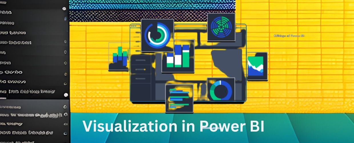
Visualization involves transforming raw data into visual representations like charts, graphs, maps, and interactive dashboards. Power BI provides various visualization options, including bar charts, line charts, scatter plots, pie charts, and treemaps. Users can create dynamic visualizations by adding filters, highlighting data points, and incorporating drill-down capabilities. Power BI’s intuitive interface allows users to explore and interact with visualizations, enabling them to uncover patterns, trends, and insights within their data.
Data Exploration and Analysis
Power BI lets users explore and analyze data effectively. The interactive visualizations provide a user-friendly interface for navigating large datasets, drilling into specific details, and filtering data based on various criteria. Users can comprehensively understand the data by identifying patterns, outliers, and correlations within visual representations. With Power BI’s built-in analytical capabilities, users can perform calculations, create custom measures, and apply advanced analytics techniques to analyze the data further.
Clear and Compelling Communication
Visualization in Power BI allows users to communicate complex information clearly and compellingly. Visualizations enhance data storytelling by presenting insights and trends visually, making it easier for stakeholders to understand and interpret the information. Users can create visually appealing reports and dashboards, combining multiple visualizations into a cohesive narrative. Customizing colors, labels, and formatting options in Power BI enables users to create visually engaging visualizations that capture attention and facilitate effective communication.
Real-Time Monitoring and Insights
Power BI’s real-time capabilities empower users to monitor data and gain real-time insights. Users can connect Power BI to various data sources, such as databases, cloud services, and streaming data, to receive live updates and continuously monitor key metrics. Real-time visualizations enable users to track performance, identify emerging trends, and respond promptly to changing conditions. With the ability to set up alerts and notifications based on predefined thresholds, Power BI ensures that stakeholders stay informed and can take immediate action when necessary.
Interactivity and Self-Service Analytics
Visualization in Power BI promotes interactivity and self-service analytics, empowering users to explore and analyze data independently. Power BI’s drag-and-drop interface allows users to easily create and modify visualizations without complex coding or technical expertise. Users can interact with visualizations by selecting data points, applying filters, and drilling down to granular details. Power BI’s natural language querying feature, Q&A, allows users to ask questions in plain language and receive visual answers, enhancing the accessibility and usability of the platform.
Collaboration and Sharing
Visualization in Power BI facilitates cooperation and sharing of insights across teams and organizations. Users can publish their visualizations to the Power BI service or Embedded to enable sharing with stakeholders. Power BI offers various sharing options, including embedding visualizations in websites, creating shared dashboards, and distributing reports via email or mobile devices. Collaborative features in Power BI enable multiple users to work on the same visualizations simultaneously, fostering teamwork, alignment, and data-driven decision-making across the organization.
Integration with Other Tools and Services
Visualization in Power BI seamlessly integrates with other Microsoft tools and services, enhancing its capabilities and expanding functionalities. Users can leverage Power BI alongside Excel, Azure, SharePoint, and other Microsoft applications to improve data analysis and reporting. Integration with Azure Machine Learning enables users to incorporate machine learning models into Power BI visualizations, enabling predictive analytics. Power BI’s extensibility options allow users to integrate custom visualizations or connect to third-party applications, extending its capabilities to meet specific business needs.
Conclusion
Visualization in Power BI empowers users to transform data into actionable insights and communicate information effectively. With its intuitive interface, vast visualization options, and analytical capabilities, Power BI enables users to explore, analyze, and share data-driven insights seamlessly. The benefits of visualization in Power BI include enhanced data exploration, clear communication, real-time monitoring, interactivity, collaboration, and integration with other tools and services. As organizations continue to embrace data-driven decision-making, visualization in Power BI plays a pivotal role in enabling users to unlock the power of their data and drive business success.