
In today’s data-driven world, organizations can access vast amounts of data. However, data alone does not guarantee understanding or insights. Business Intelligence (BI) visualization is a powerful tool that enables organizations to transform complex data into meaningful and actionable insights. By presenting data visually, engaging, and intuitively, BI visualization empowers decision-makers to grasp information quickly, identify trends, and make informed decisions. This article explores the concept of BI visualization, its benefits, key considerations, and best practices for effective implementation.
Understanding BI Visualization
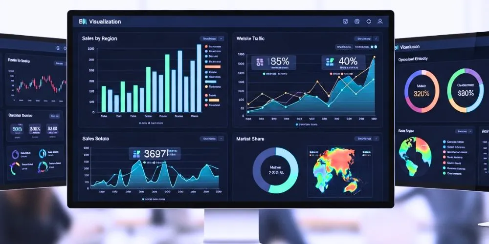
BI visualization refers to using graphical representations, such as charts, graphs, maps, and dashboards, to present complex data visually. It enhances data comprehension by transforming raw data into meaningful, easily interpretable visualizations. BI visualization tools enable users to explore data, identify patterns, uncover insights, and communicate information effectively.
Benefits of BI Visualization
I have found that using BI Visualization has many benefits. It allows me to easily analyze and understand complex data sets, which helps me make better decisions.
Improved Data Comprehension
Humans are visual beings, and BI visualization leverages this natural ability to process and understand information. By presenting data visually, complex concepts and relationships become easier to grasp. Visualizations simplify data interpretation, allowing users to identify patterns, trends, outliers, and correlations effectively.
Enhanced Decision-Making
BI visualization facilitates data-driven decision-making by providing decision-makers with clear and actionable insights. Interactive visualizations enable users to explore data from different angles, drill down into specific details, and uncover insights that might not be apparent in raw data. This enhanced understanding empowers decision-makers to make informed choices and drive organizational success.
Increased Efficiency and Productivity
BI visualization accelerates data analysis and reporting processes, increasing efficiency and productivity. Visualizations enable users to absorb information more quickly than traditional tabular data formats. With streamlined data comprehension, users can focus on analyzing insights, identifying trends, and taking action promptly, saving valuable time and resources.
Effective Communication
Visualizations are powerful communication tools that transcend language and technical barriers. Presenting data visually makes complex information accessible to a wide range of audiences, including non-technical stakeholders. Visualizations facilitate effective communication, ensuring that insights and findings are understood and shared across the organization, leading to better alignment and collaboration.
Key Considerations for BI Visualization
When utilizing BI Visualization, it is important to consider factors such as the type and source of data, the audience for the visualization, and the level of interactivity needed.
Data Relevance and Accuracy
Ensuring the relevance and accuracy of data is crucial for meaningful visualization. Data quality and integrity are foundational to reliable insights. Organizations must establish robust data governance practices, implement data validation processes, and maintain data consistency to ensure accurate and reliable visualizations.
Contextual Understanding
Effective BI visualization requires a deep understanding of the business context and objectives. Visualizations should align with the specific needs of stakeholders and convey the intended message. Prioritizing the right metrics, selecting appropriate visual representations, and providing context around the data enhance the relevance and impact of visualizations.
User-Centric Design
User-centric design is essential to create intuitive and user-friendly visualizations. Consider the target audience’s needs, preferences, and technical proficiency when designing visualizations. User testing and feedback loops can help refine and improve the design to ensure a seamless user experience.
Best Practices for BI Visualization
Regarding Best Practices for BI Visualization, there are a few key factors to remember. It is important to start by identifying the specific insights you want to communicate and the audience you are trying to reach.
Choose the Right Visualizations
Select visualizations that best represent the data and enable effective analysis. Common visualizations include bar charts, line charts, pie charts, scatter plots, heat maps, and maps. Consider the characteristics of the data, the intended message, and the audience’s familiarity with different visualization types.
Simplify and Focus
Keep visualizations simple, uncluttered, and focused on the key message or insight. Avoid excessive data points or unnecessary decorations that can distract from the main story. Prioritize clarity and simplicity to ensure users understand and interpret the visualization effortlessly.
Utilize Interactivity
Interactive visualizations enable users to explore data and uncover insights at different levels of detail. Implement interactive features such as drill-down capabilities, filtering options, and tooltips to enhance user engagement and provide a more immersive and personalized data exploration experience.
Optimize for Mobile Devices
As mobile usage increases, optimizing visualizations for mobile devices is important. Responsive design principles ensure that visualizations adapt to different screen sizes and orientations. Consider the constraints of mobile devices and prioritize simplicity and readability when designing for mobile BI visualization.
Regularly Review and Iterate
BI visualization is an iterative process. Regularly review and assess visualizations to ensure they align with evolving business needs and user requirements. Solicit feedback from users, stakeholders, and decision-makers to improve the effectiveness and relevance of visualizations continuously.
Conclusion
BI visualization is a powerful tool that enables organizations to unlock the true value of their data. By transforming complex data into visually compelling and easily interpretable insights, BI visualization empowers decision-makers to make informed choices, enhance productivity, and drive business success. When implemented with considerations for data relevance, accuracy, user-centric design, and best practices, BI visualization becomes a vital asset for organizations seeking to maximize the potential of their data and leverage it to gain a competitive edge in today’s data-driven business landscape.